
Beyond open rates: the outreach KPIs that actually predict revenue
The three tier KPI framework for B2B outreach, with 2026 benchmarks and the equation that turns them into a pipeline forecast.
The worst outreach meeting I ever sat in lasted eleven minutes. A VP of Sales had a slide with one number on it, a 47% open rate, and a CFO who wanted to know how many deals it had produced. Nobody could answer. Not because the data was missing, but because nothing anyone tracked connected to anything the CFO cared about. The open rate was real. It was also, as we worked out later, roughly 40% Apple's mail proxy loading images for people who never saw the message.
That gap between what outreach teams measure and what the business asks for is the reason this article exists. Most programmes track a handful of engagement metrics, report them weekly, and have no way to answer "did it produce pipeline" without a spreadsheet somebody builds by hand the night before the QBR.
The fix isn't more metrics. It's fewer, arranged so each one answers a question the one above it can't. What follows is the framework I use, the 2026 benchmarks for every number in it, and the equation that turns them into a forecast you can put in front of a CFO.
Quick summary: the numbers that matter
| Metric | 2026 target | Where it bites |
|---|---|---|
| Delivery rate | over 97% | Below 95%, something is broken upstream of your copy |
| Bounce rate | under 1.5% | Google and Yahoo enforce at 2% |
| Spam complaint rate | under 0.05% | Enforcement at 0.3%, but reputation degrades from 0.1% |
| Inbox placement rate | over 92% | Global average is 87.2%, and most teams never measure it |
| Total reply rate | 3% to 5% | Average is 3.43%. Counts volume, not quality |
| Positive reply rate | over 2% | The single most revenue predictive number here |
| Positive share of all replies | over 50% | Below this you are generating noise |
| Click through rate | 2% to 5% | The last engagement signal a human has to choose to make |
| Calendar conversion rate | over 1% | Average is about 1%. Elite programmes clear 3% |
| Reply to meeting conversion | 30% to 40% | Of positive replies. Below 30% is a scheduling problem |
| Open rate | do not track it | Inflated 15 to 35 percentage points, and the pixel costs deliverability |
Why the open rate stopped being a metric
Deal with this first, because until it's settled every other number is contaminated.
Apple's Mail Privacy Protection, shipped with iOS 15 in 2021, pre-loads tracking pixels whether or not a human opens the message. Apple Mail accounts for roughly 49% of tracked opens in cold outreach (Stripo's 2026 benchmarks). So about half your open rate is a machine, and the half that isn't gets diluted further by corporate security gateways that scan every inbound message on arrival.
The practical effect isn't that open rates went down. They went up, which is worse, because it looks like good news. One newsletter in a widely circulated 2024 analysis went from 28% to 55% overnight with no change in behaviour. Reported inflation across the industry runs 15 to 35 percentage points.
Here's what makes it unsalvageable: the inflation isn't uniform. It varies with how many of your recipients use Apple Mail and how aggressive their employer's security stack is. A campaign to enterprise mailboxes and a campaign to small business mailboxes aren't comparable on opens, even though your dashboard puts them in the same column. You can't correct for it either, because the correction factor is different for every list.
And you pay for it. The pixel is a remote image request to a domain that isn't the one in your From address, in a message to someone who never asked to hear from you. That pattern has been a spam signal for years, for the obvious reason that genuine one to one email almost never contains one. It also forces an HTML body, which quietly rules out sending anything that looks like a message a person typed.
So the trade is a number you can't trust in exchange for a small permanent deliverability penalty. We took the other side of it in the product and wrote up the full argument separately.
What to do instead: delete the metric from your dashboard. Not deprioritise it, delete it. As long as it's on the screen somebody will optimise a subject line against it.
The three tiers, and why the order matters
Every outreach KPI answers one of exactly three questions, and they stack:
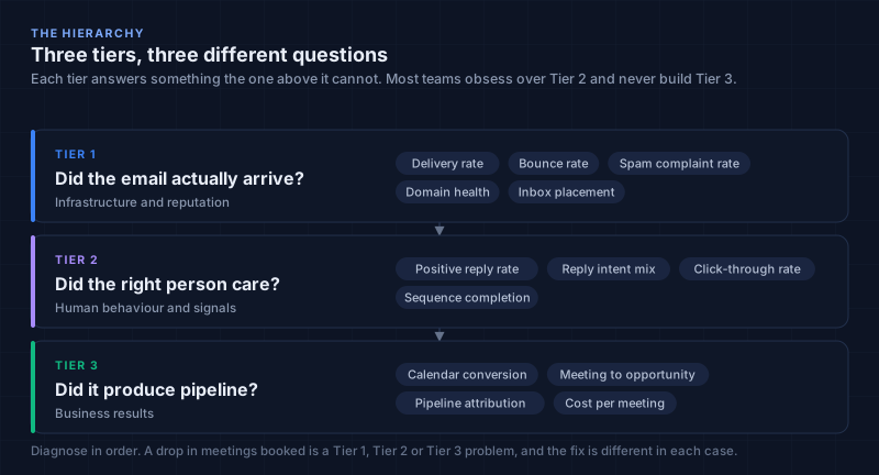
The hierarchy isn't organisational tidiness. It's a diagnostic tool, and it earns its keep on the day meetings booked drops 40% and nobody knows why.
That drop has three possible causes. Mail stopped arriving (Tier 1). Mail arrived and nobody cared (Tier 2). People cared and the process downstream fumbled it (Tier 3). Those have completely different fixes, and the expensive mistake is guessing between them. I once watched a team spend three weeks rewriting sequences when their DMARC policy had been silently rejecting a third of their volume since a DNS change nobody logged.
Two failure patterns show up constantly.
Tier 2 obsession. The team reports reply and click rates every week and has never looked at inbox placement. Around 16.9% of cold sends never reach a human inbox at all (Martal's 2026 analysis). If that's your situation, every Tier 2 number you're optimising is computed against a denominator that's quietly wrong.
Missing Tier 3 entirely. Delivery and engagement get tracked, pipeline never does, and outreach stays a cost centre in the CFO's mental model forever. This is the more common failure and the more damaging one, because it's why budget conversations go badly.
Work top down. A Tier 2 number only means something if Tier 1 is healthy, and a Tier 3 number only means something if Tier 2 is.
Tier 1, did the email actually arrive
These are gates, not goals. If Tier 1 is failing, nothing below it means anything.
Delivery rate
The percentage of sends that reach the recipient's mail server. Not the inbox. The server.
Delivery rate = (delivered ÷ sent) × 100
Healthy sits between 95% and 99%, and I want over 97%. Below 95% something is wrong. Below 90%, stop sending and fix it before you do anything else.
The diagnostic value is in the shape of the drop, not the number:
- One sender drops, others stable. A domain specific blocklist entry, or an authentication failure on that domain.
- Gradual decline across every sender. List hygiene rotting, or you skipped warmup and are now paying for it.
- Delivery over 99% but inbox placement under 85%. Mail is arriving at the building and being filed in the bin. That's a content or reputation problem, not a delivery problem, and it's invisible if delivery rate is the only thing you watch.
Bounce rate
Bounce rate = (bounced ÷ sent) × 100
Google and Yahoo enforce at 2%. Top performers run under 1.5%. The industry average is about 5.1% (Cleanlist), which tells you most senders operate in the danger zone and get away with it until they suddenly don't.
Hard bounces mean the address doesn't exist. Remove them within 24 hours, everywhere, not just from the campaign that surfaced them. Soft bounces are temporary: retry three times, then treat as hard.
The number that reframed this for me is that roughly 7 to 8% of cold emails bounce, and bounces plus provider level filtering mean about 16.9% of sends never reach a human. Nearly one in five, along with the sending cost attached to every one.
Most of it is preventable, and prevention has to happen before enrollment rather than at send time. Validate syntax, check the MX records actually resolve, and flag role addresses (info@, sales@, no-reply@), which bounce and complain at far higher rates than named mailboxes. Tantra runs those three checks before a contact is enrolled and quarantines the failures rather than sending to them, recording the rejection reason so you can trace a bad list back to its source.
Spam complaint rate
Spam complaint rate = (complaints ÷ delivered) × 100
This is the one that ends programmes, so be precise about the numbers, because two of them circulate and people treat them as alternatives.
| Threshold | Rate | What it means |
|---|---|---|
| Enforcement ceiling | 0.3% | The Google, Yahoo and Microsoft bulk rule. Never cross it |
| Recommended maximum | 0.1% | Google's published guidance. Operate below this |
| Alert here | 0.05% | Half the recommended maximum, so you get warning |
The important thing is that the damage starts well below the enforcement line. By the time you touch 0.3% your reputation has already degraded. Enforcement is the consequence, not the beginning. That's why 0.1% is the number worth alerting on and 0.05% is the number worth investigating.
A complaint is also categorically different from a bounce. A bounce is a technical failure. A complaint is a human deciding your email is unwanted, which is why providers weight it so heavily. And reputation attaches to the domain, so one careless campaign taxes every sender on it.
Domain health
Four components, checked daily:
| Check | What it proves | How it fails |
|---|---|---|
| SPF | These servers may send as this domain | A second TXT record, or blowing the 10 lookup limit |
| DKIM | The message wasn't altered in transit | Key never published, or a vendor signs with its own domain |
| DMARC | What to do when the other two fail | Alignment never verified, then p=reject set anyway |
| DNSBL | You aren't on a public blocklist | Shared IP neighbours, or a spam trap hit |
Fully authenticated domains land in the inbox 95 to 98% of the time. Unauthenticated ones sit under 85%. Around 77% of deliverability problems trace back to domain health (Mailforge), which makes this the highest leverage checklist in the framework and also the most neglected, because it's boring and it's DNS.
The failure that catches almost everyone is DMARC alignment rather than the records themselves. A message can pass SPF perfectly for a vendor's domain and still fail DMARC, because the From address the reader sees is yours. I unpacked that one properly, along with the SMTP error codes that tell you which of the four broke, in the Google Workspace setup manual. Tantra scans every sending domain daily against exactly these four checks.
Inbox placement rate
The percentage of delivered mail landing in the primary inbox rather than spam or promotions.
Delivery rate and inbox placement aren't the same thing, and the difference is where most programmes quietly bleed. Delivery means it arrived at the building. Placement means somebody put it on the desk.
The global average is 87.2% (Validity's 2026 benchmark). Healthy is 87% to 90%, and you want over 92%. Here's the statistic that explains why so few teams hit it: 87% of senders never run inbox placement testing at all (Validity, 2025). They're optimising a funnel with an unmeasured hole in the top.
Measuring it takes seed accounts across Gmail, Outlook and Yahoo, checked before every significant campaign. It's manual and slightly tedious and there's no way around that, because no provider reports placement back to senders. Worth knowing that the spam decision and the tab decision are separate systems with separate inputs: the full breakdown is here.
The Tier 1 dashboard
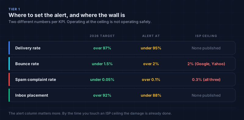
Note the two columns. The alert level is what matters operationally. The ceiling is where consequences become visible. Teams that manage to the ceiling are managing to the point where the damage is already done.
Tier 2, did the right person care
Total reply rate is a vanity metric in disguise
Total reply rate = (replies ÷ delivered) × 100
The 2026 average is 3.43%, down from 5.1% in 2024. Good campaigns run 5% to 10%, elite ones clear 10%. Campaign size matters more than most people expect: under 50 recipients averages 5.8%, over 500 drops to 2.1% (Mailforge). Smaller and better targeted beats bigger, consistently.
But total reply rate has the same defect as open rate, just less obviously. "Send me pricing" and "remove me from your list" both count as one reply. A campaign can post a beautiful reply rate while generating nothing but annoyance.
Positive reply rate
This is the number I'd keep if I could only keep one.
Positive reply rate = (positive replies ÷ delivered) × 100
A positive reply signals genuine interest or forward motion. Not objections, not auto responses, not opt outs. The industry average is about 2% of total sends, targeted campaigns hit around 4%, and positive replies typically make up 40% to 60% of all replies. If yours is below half, your targeting is wrong.
Why it beats total reply rate:
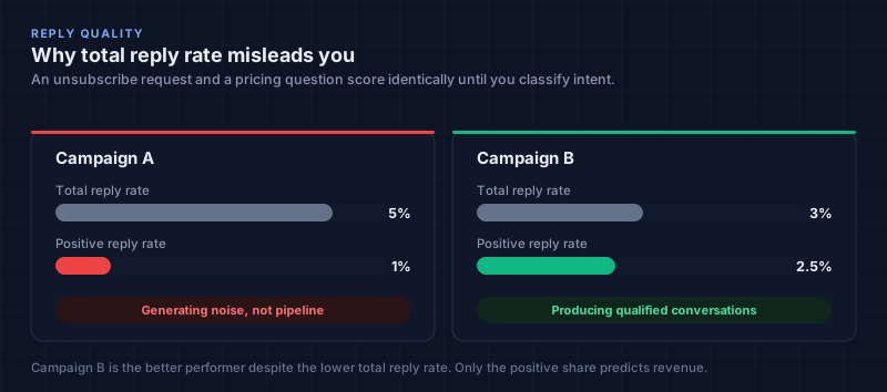
Campaign A looks better on every dashboard in the industry. Campaign B is producing two and a half times the qualified conversations. If you report total reply rate to leadership, you will eventually be asked to make Campaign A's number bigger, and you'll do it by sending more email to worse lists.
Classifying intent is what makes it measurable
Positive reply rate is only trackable if something classifies replies consistently. By hand it works to roughly 50 replies a week, then it silently stops happening.
| Intent | Example | Next action |
|---|---|---|
| Interested | "This is timely, can you send pricing?" | Route to AE, book the meeting |
| Pricing objection | "Interesting, but out of budget" | Nurture, revisit in 90 days |
| Timing objection | "Reach out next quarter" | Schedule the follow up |
| Referral | "Not me, talk to our ops lead" | New prospect record |
| Question | "How does this work with Salesforce?" | Route to SDR |
| Out of office | "Back on the 14th" | Pause, resume after |
| Not interested | "Please remove me" | Suppress globally |
| Auto reply | "No longer with the company" | Update the record, find the replacement |
Only the first counts as positive. The referral and the question are valuable, but they're not the same signal, and folding them in inflates the number you're forecasting against.
One caveat on automating this, since it's the part people get oversold. Classification accuracy depends heavily on how clean your categories are and how much genuinely ambiguous mail you get. Keyword rules give you a rough sort. Transformer models do better because they read each word in the context of the whole sentence rather than in isolation (Devlin et al., 2019). But treat any specific accuracy figure you see quoted with suspicion unless someone tells you what corpus produced it. Mine included.
Click through rate
2% to 5% is the working range. A click is the last engagement signal a human has to actively choose to make, which is exactly why it survived the collapse of the open rate.
It has the same bot contamination problem, so filter rather than reporting raw. The strongest rule is timing: a click arriving under five seconds after send is a gateway pre-fetch, because nobody reads a cold email and clicks that fast.
Track clicks through a signed link on your own tracking domain, never a third party redirect, which filters increasingly read as obfuscation. In Tantra the redirect token is HMAC signed and verified in constant time so it can't be forged by editing the URL, and you can point it at your own subdomain with a CNAME so the tracking domain stays aligned with the sending domain.
Sequence completion rate
The percentage of prospects who receive every step without bouncing, unsubscribing or being stopped.
If 40% drop out after step two, your per step analytics for steps three and four are computed on a self selected remnant and mean much less than they appear to. This metric is how you find that out.
One rule that isn't optional: sequences must stop automatically when someone replies. Continuing to email a person who already responded is a spam complaint you've scheduled in advance. It shouldn't be a setting anyone remembers to switch on. In Tantra, reply detection moves the enrollment to a replied state on the first genuine reply, and the scheduler only picks up active enrollments, so the remaining steps never come due. The enrollment lifecycle documents the full state machine.
Tier 3, did it produce pipeline
Calendar conversion rate
Calendar conversion = (meetings booked ÷ delivered) × 100
About 1% on average. Elite programmes clear 3%. If your positive reply rate is 2% and your meeting rate is 0.2%, the problem isn't your email. It's whatever happens in the eight hours between someone saying yes and someone offering them a time.
The bridge metric is reply to meeting conversion: 30% to 40% of positive replies should become meetings, and top performers clear 50%. Below 30% is a scheduling or speed to lead problem, full stop. Track meetings held against meetings booked too. A no show rate over 20% means you're booking people who were never really qualified.
Meeting to opportunity rate
The percentage of held meetings that become qualified opportunities. Around 3.43% for cold prospecting (Apollo's benchmark), though this varies enormously by deal size and segment, so your own historical number beats any published figure.
Its value is comparative. If cold outreach meetings convert at 10% while your company average is 35%, that isn't an email problem. It's ICP definition or SDR qualification, and rewriting sequences won't touch it.
Attribution
Cold email is usually the first touch in a chain running through several more before anyone signs. Both single touch models get it wrong in opposite directions: first touch overstates email's role, last touch erases it.
U shaped attribution, weighting 40% to the first touch, 20% across the middle and 40% to the last, reflects the actual shape of a cold outbound deal better than either. It isn't perfect. No attribution model is. But it produces a number you can defend in a budget meeting, which is the actual job.
The forecast equation
This is where the framework pays for itself, and the reason to bother with tiers at all. Once every term is a KPI you already measure, outreach becomes forecastable instead of hopeful.
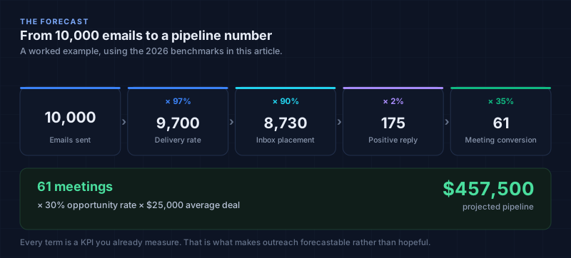
Projected meetings =
  emails sent
  × delivery rate
  × inbox placement rate
  × positive reply rate
  × reply to meeting rate

Projected pipeline =
  projected meetings
  × meeting to opportunity rate
  × average deal size
Two things this unlocks that a dashboard of engagement metrics never will.
It answers the volume question honestly. When someone asks what it would take to add $2M of pipeline next quarter, you work backwards through the chain instead of guessing. Sometimes the answer is more email. More often, a single point of improvement in positive reply rate is worth more than doubling send volume, and now you can show that rather than assert it.
It tells you which variable to fix. Run your actuals through the chain and the weakest link is arithmetically obvious:
| If this is low | The problem is | Fix before anything else |
|---|---|---|
| Delivery rate under 95% | Infrastructure | Authentication, reputation, list quality |
| Inbox placement under 88% | Content or reputation | Format, sending pattern, domain health |
| Positive reply rate under 1.5% | Targeting | ICP fit and personalisation, not subject lines |
| Meeting conversion under 30% of replies | Process | Speed to lead, scheduling friction |
| Opportunity rate below company average | Qualification | SDR handoff, ICP definition |
Work down that table in order. Fixing targeting while inbox placement sits at 80% is wasted effort, because you're improving a multiplier applied to a number that's already been decimated.
One caveat on the worked example in the figure: those inputs are benchmarks, not your numbers. Run four weeks and 500 or more sends per segment before you trust the model, and expect your reply to meeting rate in particular to differ from the published range.
Per sender, or you are averaging away the problem
Every Tier 1 metric has to be broken out per sending mailbox. Aggregates hide exactly the failure they exist to catch.
Say you run eight mailboxes and one gets blocklisted. Aggregate delivery drops from 98% to about 86%, which reads as a mild programme wide degradation. Per sender, seven mailboxes read 98% and one reads zero. Same data, completely different diagnosis, and only one of them tells you what to do this afternoon.
| Metric | Target per sender | Pull the sender at |
|---|---|---|
| Delivery rate | over 97% | under 95% |
| Bounce rate | under 1.5% | over 2% |
| Spam complaint rate | under 0.05% | over 0.1% |
| Inbox placement | over 92% | under 88% |
| Domain health | all four checks pass | any single failure |
Running everything through one mailbox is the version of this you can't recover from. One blocklist entry and the whole programme goes dark.
On volume, the ceilings that actually apply:
- Google Workspace: 1,500 recipients per mailbox per day. Google's published policy, and a hard wall rather than a setting.
- Practical cold outreach limit: 50 to 100 a day per mailbox. An order of magnitude below the technical ceiling, and that gap is deliberate.
- Conservative standard: about 30 a day. Where I'd start on a new domain.
New mailboxes ramp: 5 to 10 a day in week one, 15 to 20 in week two, 25 to 30 in week three, 40 to 50 in week four, then production. Skipping warmup is the fastest way to burn a domain, and a burned domain takes months to rehabilitate if it recovers at all.
The suppression list has to be global
A suppression list scoped to one campaign isn't a suppression list. It's a delay.
The scenario is mundane and I've watched it happen more than once. Team A suppresses a contact after a spam complaint. Three weeks later Team B enrolls the same contact from a different list in a different campaign. The second complaint arrives, and because complaints attach to the domain, both teams now have a reputation problem.
Everything goes on one list, propagating to every sender and campaign within minutes: hard bounces, spam complaints, unsubscribes, explicit opt out language in replies, known spam traps, and anything legal asks you to exclude.
Four numbers worth watching:
| Metric | Target | What it tells you |
|---|---|---|
| Suppression list growth rate | monitor weekly | Sudden growth means a bad list source |
| Suppression to send ratio | under 0.5% | Higher means you're emailing unwilling people |
| Repeat suppression hits | zero | Any repeat means propagation is broken |
| Time to suppress | under 1 hour | Delay is how you collect the second complaint |
Repeat hits should be zero. If that number isn't zero, propagation is broken somewhere, and it will cost you a domain eventually.
Related: spam traps. Pristine traps are addresses that never belonged to anyone, so hitting one means you bought or scraped a list. Recycled traps are abandoned real addresses, so hitting one means you haven't cleaned in a year or more. Typo traps catch misspelled domains and mean your validation is weak. Each type tells you something specific about which practice is failing.
The daily checklist
Ten minutes, automated where possible, run per sending domain and mailbox.
Authentication
- SPF valid and includes every current sending service
- DKIM signature valid, key not expired
- DMARC active, minimum
p=quarantine, aggregate reports actually being read - Zero DNSBL listings across Spamhaus, SURBL, Barracuda and SORBS
Reputation
- Spam complaint rate under 0.1% per sender
- Bounce rate under 2% per sender
- No sudden spike in unsubscribes
- Postmaster Tools and SNDS reputation checked
Volume
- Per mailbox volume inside the warmup schedule
- No single mailbox over its safe limit
- Sending windows aligned to the recipient's timezone, not yours
The point of the cadence is that Tier 1 problems compound silently. A domain health issue caught the same day costs an afternoon. Caught six weeks later, after reputation has degraded, it costs the domain.
The mistakes I see most
Reporting averages across senders. Still the most common. The average hides the one broken mailbox dragging everything down.
Optimising subject lines against open rate. You're optimising against how aggressively your recipients' IT departments scan mail. Nothing else.
Treating any reply as a win. Without intent classification your headline engagement number includes people asking to be left alone.
Measuring inbox placement never, then panicking quarterly. Seed tests before major campaigns, or you're guessing about the biggest hidden variable in the chain.
Chasing the ISP ceiling. Operating at a 0.25% complaint rate because "the limit is 0.3%" means operating with permanently degraded reputation. The limit is where enforcement starts, not where harm starts.
Building Tier 3 last, or never. This is the one that costs budget. If you can't connect outreach to pipeline, outreach is a cost line in someone's spreadsheet, and cost lines get cut.
Forecasting off benchmarks instead of your own numbers. Published benchmarks are a starting hypothesis. Four weeks of your own data beats every figure in this article, including the ones I'm confident about.
What a platform can and cannot do here
Worth being straight about the split, because tooling gets oversold on exactly this topic.
What software genuinely handles. Per sender Tier 1 measurement, because it's mechanical. Tantra records delivery, bounces and complaints per mailbox, scans each sending domain daily for SPF, DKIM, DMARC and blocklist status, and enforces per mailbox daily and hourly caps atomically, so two send jobs racing for the last slot of the day can't both take it. Reply detection and intent classification run automatically, which is what makes positive reply rate a number rather than an aspiration. Suppression propagates globally within minutes. Every state change emits a typed webhook (email.sent, email.bounced, email.clicked, email.replied, email.unsubscribed, email.sequence.completed, email.intent.classified, lead.stage.changed), so Tier 3 stitching in your CRM doesn't depend on nightly CSV exports. On the calendar side, RSVP reconciliation runs on a ten minute cycle and fires a webhook on every change.
What it can't do. It can't publish your DNS records; those live on your domain and only you can change them. It can't run seed tests, because inbox placement needs accounts at providers we don't control. It can't define your ICP, which is the actual input to positive reply rate. It can't choose your attribution model, and it certainly can't tell you whether a meeting was qualified.
The honest division: a platform can make every Tier 1 and Tier 2 number reliable and automatic. Tier 3 requires decisions about what counts as an opportunity, and those are yours.
Frequently asked questions
What is a good reply rate for cold email in 2026?
The all senders average is 3.43%. Good campaigns run 5% to 10%. But total reply rate is the wrong target. Aim for a positive reply rate over 2% and a positive share over 50% of all replies.
Should I track open rates at all?
No. Apple's Mail Privacy Protection inflates them by 15 to 35 percentage points, the inflation varies unpredictably by list, and the tracking pixel carries a real deliverability cost. Track clicks and replies instead.
Is the spam complaint limit 0.1% or 0.3%?
Both, for different purposes. 0.3% is the enforcement ceiling in the Google, Yahoo and Microsoft bulk sender rules. 0.1% is Google's recommended maximum and the level to actually operate at, because reputation degrades well before enforcement fires. Alert at 0.05%.
How many emails a day can I safely send per mailbox?
Google Workspace's hard ceiling is 1,500 recipients per mailbox per day, but that is not a target. For cold outreach, 50 to 100 a day per warmed mailbox, and about 30 on a newer domain. Ramp over four weeks from 5 to 10 a day.
What counts as a positive reply, exactly?
A response signalling genuine interest or forward motion. Pricing questions, meeting requests, "tell me more." Not objections, not out of office, not opt outs, and not referrals, which are valuable but a different signal and shouldn't inflate the number you forecast against.
How do I measure inbox placement if no provider reports it?
Seed accounts. Maintain test mailboxes on Gmail, Outlook and Yahoo, send to them as part of each significant campaign, and record where the message lands. It's manual, and there's no automated substitute, which is why 87% of senders skip it.
How long before the forecast model is trustworthy?
Four weeks and at least 500 sends per segment. Build the baseline first, then unit economics, then forecast. Investigate any variance over 15% between projected and actual rather than adjusting the model to fit.
Do these benchmarks apply outside B2B SaaS?
Directionally. The Tier 1 numbers are set by mailbox providers and apply to everyone. Tier 2 and Tier 3 benchmarks come mostly from B2B technology sending, and reply rates in particular vary a lot by industry and deal size. Treat them as a starting hypothesis and replace them with your own numbers as soon as you have four weeks of data.
What should I report to the CFO?
Meetings held, pipeline attributed, cost per qualified meeting, and the trend on each. Tier 1 and Tier 2 are operating metrics for the team running the programme. They belong in the diagnostic conversation, not the budget one.
Conclusion
Outreach reporting is usually bad not because teams lack data, but because the metrics on the dashboard were chosen for being easy to collect rather than for answering a question anyone has.
Three questions are worth answering: did it arrive, did anyone care, did it produce pipeline. Every metric that doesn't serve one of those is decoration, and the open rate isn't even decoration any more. It's actively misleading.
Start at Tier 1, because it's cheapest to fix and everything else is computed against it. Get positive reply rate instrumented, because it's the one number that predicts revenue. Then build the forecast chain, because that's what turns a channel people argue about into a channel people plan around.
If you want to see the stack running against your own sending domains, start with a free account and connect a mailbox. The domain health scan and the per sender breakdown work from day one.
Key takeaways
- Delete the open rate. Inflated 15 to 35 percentage points, the inflation varies by list so you can't correct for it, and the pixel costs deliverability.
- Three tiers, in order. Did it arrive, did anyone care, did it produce pipeline. Tier 2 numbers are meaningless if Tier 1 is broken.
- 0.3% is enforcement, 0.1% is the operating limit, 0.05% is where to alert. The damage starts long before enforcement does.
- Positive reply rate is the one to keep. Total reply rate counts "remove me" the same as "send pricing."
- Break every Tier 1 metric out per sender. Aggregates hide the single broken mailbox dragging the programme down.
- Suppression must be global and propagate in under an hour. Repeat suppression hits should be zero.
- Measure inbox placement with seed accounts. 87% of senders never do, and it's the biggest unmeasured variable in the chain.
- Build Tier 3 or stay a cost centre. Pipeline attribution is the only thing that makes the budget conversation go well.
- Forecast off your own numbers. Four weeks and 500 sends per segment before you trust the model.
Sources
- Google, email sender guidelines
- Apple, Mail Privacy Protection and privacy
- Google Postmaster Tools
- Microsoft Smart Network Data Services
- Yahoo sender best practices
- IETF RFC 8058, signaling one click unsubscribe
- Devlin et al. (2019), BERT: pre-training of deep bidirectional transformers
- Sweller (1988), cognitive load during problem solving
Benchmark figures are attributed inline to the vendor reports they come from: Instantly and Mailshake for reply rates, Validity for inbox placement and testing adoption, Woodpecker and Cleanlist for bounce and complaint data, Mailforge for campaign size effects and domain health, Martal for the share of sends that never reach an inbox, Apollo for meeting to opportunity conversion, and Stripo for Apple Mail's share of tracked opens. Vendor benchmarks are sampled from that vendor's own customer base, so treat them as directional rather than authoritative and replace them with your own numbers as soon as you have enough.
Product behaviour described here reflects the shipped code at the time of writing. Provider policies change, so check the primary sources above before building automation against any specific threshold.
Run outreach from accounts you already own
Calendar invite campaigns, or sequences across Gmail, LinkedIn, WhatsApp, and Telegram. Optional AI personalization on your own key.
Get new posts by email
Practical omnichannel outreach and invitation-led campaign tactics. No spam, and you can leave whenever you like.
Keep reading
Cold Google Calendar outreach in 2026: hard limits, warmup, and ban triggers
Every hard limit for cold calendar outreach in 2026, the warmup protocol, the ban triggers, and the psychology behind a 65% accept rate.
39 min read- Calendar Outreach
- Deliverability
- Cold Email
Google Workspace deliverability: the setup manual and the error codes that tell you what broke
How to configure SPF, DKIM and DMARC on Google Workspace, warm a mailbox properly, and read the SMTP error codes that tell you what actually broke.
18 min read- Deliverability
- Cold Email

How to land in the Gmail Primary inbox during cold outreach
Gmail makes two decisions about your email. The stop words that matter, sorted into three buckets, and the compliance trade off nobody mentions.
42 min read- Deliverability
- Cold Email